Quantcast
Channel: perfume advertising – TINSEL CREATION
Viewing all 28 articles
Browse latest View live

The Art of Perfume Ads: Estée Lauder Pleasures

$
0
0

If you’ve opened a fashion magazine over the past fifteen years or so, you’ve probably seen an advertisement for Estée Lauder Pleasures. The “face” of pleasures has changed from time to time: actress Gwyneth Paltrow and model Carolyn Murphy, as well as numerous adorable puppies, have appeared in Pleasures ads since the fragrance was launched in 1995.

In the late 1990s and early 2000s, Elizabeth Hurley was the embodiment of this best-selling sheer floral. For an ad published in 1999, Hurley posed on a swing in a forest or garden blooming with pink and white flowers (appropriately chosen to suggest the fragrance’s composition of peonies, lilies, roses, and green notes).

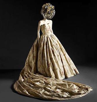
Hurley’s strapless, full-skirted gown was created for the ad campaign by Elizabeth Emanuel, who had been one of the designers behind the iconic wedding gown worn by Diana, Princess of Wales in 1981. (This dress is currently featured in the exhibition “Ballgowns: British Glamour since 1950” at the Victoria and Albert Museum in London.) So we see an Englishwoman in an English gown, modeling for a classic American company… and yet I have a feeling that the inspiration for this particular ad was French.

This image’s combination of a garden, a vine-entwined tree, and a pink-gowned woman on a rope swing makes me think of the eighteenth-century painting The Swing by Jean-Honoré Fragonard. As the website for the Wallace Collection (which owns this work) states, “The Swing is Fragonard’s best-known painting, encapsulating for many the finesse, humour and joie de vivre of the Rococo. No other work better demonstrates his ability to combine erotic licence with a visionary feeling for nature.”

Fragonard painted The Swing for an unnamed nobleman who wanted his young mistress to model for the main figure, and the finished work includes several titillating details and bits of symbolism, from the woman’s visible legs (!) to the flung slipper to the Cupid statue putting a finger to its lips in a secretive gesture. The art collected by the aristocracy of eighteenth-century France was nothing if not pleasure-oriented, which brings us back to Liz Hurley and perfume.

The “pleasures” of Estée Lauder’s fragrance are as clean and transparent as the Pleasures bottle itself, and they’re based on private moments rather than romantic encounters. Elizabeth Hurley swings her own swing (ahem?) and smiles as if to welcome us into her fantasy, or to encourage us to create similar experiences for ourselves. (I prefer this dynamic to the similarly long-term promotion of Lauder’s Beautiful, which stages a never-ending loop of wedding days.)

Am I stretching this interpretation a bit? Perhaps, but it wouldn’t be the first time that The Swing inspired another picture, and it wouldn’t be the only time that Estee Lauder borrowed imagery for a perfume advertisement in the 1990s.

To read more posts in this series, click here.

Images: Estee Lauder Pleasures via Vintage Ad Browser, Elizabeth Emanuel gown via The Economist, Fragonard’s The Swing (c. 1767, Wallace Collection, London) via Wikimedia Commons.


The Art of Perfume Ads: Lady Gaga Fame

$
0
0

Fame, the first fragrance to bear Lady Gaga’s name, will be released in September. First disclaimer: I haven’t tried it yet, so this isn’t a review. Instead, I’m taking a lighthearted look at the advertising image that was released in July. Second disclaimer: although I’m a general admirer of Lady Gaga’s music and self-presentation, I’m not an expert on her every word and deed. This is just my own, Rorschach–blot-like impression of the ad. And one quick warning: this post will include further nudity, albeit of an artistic nature. (NSFW!)

This ad for Fame (shot by Steven Klein) is refreshingly unlike any other perfume ad that we’ve seen lately: no embracing male-female couple, no evening gown, no grassy meadow, no fancy interiors, no flowers. Just the Lady herself, posed like an odalisque, nude except for clusters of tiny, thong-clad men and a black leather mask.

Given the subject of the fragrance, and many of her songs, I’m tempted to look at this set-up as a metaphor for “fame.” Do the climbing men symbolize the star’s fans (yes, the “little monsters”), latching onto her glamor and power? Or do they represent the many moving parts of the fame-machinery that has made her a household name?

And what about that mask? It could just be a bondage reference (again, not one of my particular areas of expertise). On the other hand, it does remind me of certain older photographs that I’ve seen.

A few years ago, a work project led me to read about E. J. Bellocq’s photographs of female prostitutes in New Orleans, shot in the red-light Storyville neighborhood at the close of the nineteenth century and the opening years of the twentieth century. Bellocq photographed the women in the rooms where they lived and worked, sometimes unclothed, occasionally wearing masks to protect their identities.

You can read more about Bellocq and his Storyville portraits in a post on the Smithsonian blog, here. They’re memorable images, not just because of the nudity and the masks, but because the women seem to be captured as individuals, “off-duty.”

Bellocq has been a strong source of inspiration for the living photographer Joel-Peter Witkin, who has restaged and expanded some of Bellocq’s Storyville tableaux. I’m not really a fan of Witkin’s work, but I do know that he has influenced everyone from Alexander McQueen to David Fincher, and I’m sure that the Haus of Gaga is aware of his art too.

Witkin has posed a variety of nude models in masks, including these three hermaphrodites [correction: pre-operative transsexuals] in a parody of the classical “Three Graces.” He constantly borrows and transforms images from art history, and then the cycle is perpetuated when he in turn inspires other artists.

On the other hand, there was something else about the Fame ad that seemed familiar to me, something not quite as historical. When a certain memory came to my mind, I laughed and then I tracked it down on the internet.

Remember those little muscular men? (Apparently the model Zeb Ringle posed for most of them.) Well, they reminded me of certain posters and prints that were sold at shopping-mall gift shops in the late 1980s and early 1990s (and still might be sold there, for all I know.)

These “bodyscapes” by the “self-taught photographer” Allan I. Teger (as you can see by the copyright information!) play with scale by placing miniature human figures on a nude body.

I’m still not sure whether these scenes are meant to be humorous, or whether I’m laughing for the right reasons. I actually haven’t thought about them in years, and I didn’t expect them to surface in my memory in connection with Lady Gaga, that’s for certain.

Part of the fun of Lady Gaga, for me, is seeing how she and her collaborators, her fellow magpies, pick and choose from fashion and art and popular culture of all kinds. I’m probably making my own connections here, like a game of free association, but that’s part of the fun too.

What do you see in Lady Gaga’s Fame advertisement?

Images: Bellocq photographs via Fraenkel Gallery; Witkin photographs via Edelman Gallery and Museum of Contemporary Photography; Allan I. Teger photographs via Bodyscapes.

To read more posts in this series, click here.


The Art of Perfume Ads: Jennifer Aniston

$
0
0

I don’t usually say or think much about Jennifer Aniston, because she and her acting career and her romantic travails generally don’t interest me. However, when her début fragrance was released in 2010 and arrived in the United States a year later, she edged her way a bit further into my awareness.

I’ve heard the fragrance is nice enough, but as so often happens, I’ve spent more time looking at the ad than sampling her eponymous scent at Sephora. If  Ms. Aniston is playing a larger part than usual in my conscious mind, then her ad has touched upon something buried deep in my unconscious.

I’ve been remembering a photograph of Jane Fonda, taken around 1966 when she was in her late twenties. At the time she was breaking out of her image of Hollywood royalty and the “girl next door” by revealing a sexier, more rebellious side. (She would star in Barbarella in 1968.)

Something about the pose, the windblown hair, and the rocky beach landscape seem to be echoed in Jennifer Aniston’s perfume advertisement.

I first came across this photo in a large, image-stuffed book called The Best of LIFE, which reproduced hundreds of pictures from LIFE magazine. The book credited this photograph to Jean-Pierre Lagarde.

There are only so many ways that a female body can be arranged for a photograph, of course, especially when you’re trying to achieve a sexy-but-not-unpublishable look. Still, I have a feeling that this photo of Fonda has been influential on many fashion/celebrity shoots.

Someone, somewhere seems to have decided that this legs-and-arms-crossed, is-she-really-nude pose seems to suit Jennifer Aniston well, since she has also assumed it for her SmartWater advertisements.

(Full disclosure: here, I’ve naughtily flipped the color photo of Jane Fonda’s Italian beach session  in order to emphasize the similarity.)

This isn’t the Jane Fonda that I knew from my earlier years, the bodysuit-clad, aerobic-workout goddess. Looking at her life, I’m fascinated by the number of times she has “reinvented” herself.

It’s interesting, how two women can model in similar poses (and hairstyles), against similar backdrops, and create such different moods. Where Jane was going for shock and sex appeal, Jennifer is falling back on her low-maintenance, comfortable familiarity—not reinvention at all.

Maybe I’d find Ms. Aniston more intriguing if she did give us something new, once in a while. But, as I said, I’ve never really been a fan.

To read more posts in this series, click here.


The Art of Perfume Ads: Houbigant Chantilly (1960s)

$
0
0

In 1941 the classic French perfume house of Houbigant released Chantilly, an Oriental fragrance with notes of bergamot, lemon, neroli, jasmine, rose, ylang-ylang, carnation, orris, sandalwood, vanilla, benzoin, tonka, and musk. (I’ve just consulted its entry in my trusty H & R Fragrance Guide; you can also read more about the fragrance’s history here.)

Chantilly has been promoted in many, many print advertisements over the past seventy years, and more than once its ads have incorporated famous works of art. In this magazine ad from 1965, a cherub nestles on a cloud (of Chantilly lace!) over the slogan, “Nice girls do wear Chantilly.”

That angel is certainly a familiar little figure. He’s borrowed from Raphael’s Sistine Madonna, which was painted in 1512-13 as an altarpiece for a Benedictine monastery. (The Wikipedia entry for this painting isn’t too bad… take a look here!)

The two angels at the bottom ledge, who look up at Mary and the infant Christ, Saint Sixtus, and Saint Barbara, have become much more famous than the altarpiece’s main figures. They’ve appeared on their own everywhere from T-shirts to tissue boxes to postal stamps.

Like many people, I’ve always been fond of these angels, as well as the overall painting. (A reproduction of the Sistine Madonna hung in a corridor of my Catholic high school; I remember doing my homework under it.)

The naughty-nice dichotomy is always an oversimplification, but it becomes even funnier in this context, when you consider that Raphael created this angel to accompany the original “nice girl,” the Madonna herself.

I’ve never worn Chantilly, and it probably had been altered by the time I was old enough to wear it, but now that I’ve been thinking about its advertisements, I may seek out a sample of its vintage formulation to try.

Note: to read more posts in this series, click here.

Images: Chantilly ad (1965), via Vintage Ad Browser; Raphael, Sistine Madonna (1512-13), via Staatliche Kunstsammlung, Dresden; LOVE stamp (1995) via USStampGallery.


The Art of Perfume Ads: Houbigant Chantilly (1990s)

$
0
0

Chantilly--woman behind lace--various women's mid90s

A while ago, I wrote about a Houbigant Chantilly perfume advertisement from the 1960s and its unlikely visual source (an altarpiece painting by Raphael!). The good people at Houbigant seem to have flipped through their art library more than once over the decades. This ad from the 1990s, which places its model behind a scrim of white Chantilly lace, is very probably influenced by an iconic work of modern photography.

Gloria-Swanson-Edward-Steichen-2

In the 1920s, American photographer Edward Steichen was working for Condé Nast as the chief photographer for Vogue and Vanity Fair. In his memoir A Life in Photography, he recalled a 1924 sitting with the movie star Gloria Swanson:

At the end of the session, I took a piece of black lace veil and hung it in front of her face. She recognized the idea at once. Her eyes dilated, and her look was that of a leopardess lurking behind leafy shrubbery, watching her prey. You don’t have to explain things to a dynamic and intelligent personality like Miss Swanson. Her mind works swiftly and intuitively.

Steichen can be credited with bringing a fine-art approach to celebrity photography and fashion photography, and his work is still frequently imitated. His woman-behind-lace composition seems to have promptly inspired similar shots, such as Erwin Blumenfeld’s Violettes de Montezin of 1938:

violette

But the intense, non-smiling gaze, the careful positioning of the lace’s botanical motifs to frame the features, and the close-up on the face in Steichen’s earlier photograph all suggest that it is the most likely source for the Chantilly advertisement (and many other ads and fashion shoots since 1924).

Houbigant had already used the idea of placing the Chantilly model in its namesake lace, as in this mid-1980s ad (which inspired more than a few of my classmates to copy its frosty-mauve makeup palette!):

Chantilly mid 1980s

“I feel very Chantilly today.” That tagline, silly as it is, sounded a bit provocative to me at the time. Perhaps it still does. In any case, the Steichen-derived 1990s image seems to be aging more gracefully. It feels more classical, and it really does steal from the best.

And here’s a shot of Edward Steichen at work, to close this post…

edward-steichen-self-portrait-with-photographic-paraphernalia-photographs-silver-print

To read more posts in this series, click here.

Images:  Houbigant Chantilly advertisements via Parfum de Pub; Edward Steichen, Gloria Swanson (1924), Condé Nast Archive/Corbis, via Smithsonian Magazine; Edwin Blumenfeld, Violettes de Montzarin (1928), via Christie’s; Edward Steichen, Self-Portait (1929) [cropped], Condé Nast Archive, via Artnet.


The Art of Perfume Ads: Anna Sui Live Your Dream

$
0
0

anna sui live your dream

In honor of New York Fashion week, here’s a look at a perfume advertisement from Anna Sui, my favorite living designer. (Not to offend her by qualifying that statement with “living,” but I do love Paul Poiret! and Jeanne Paquin and early Chanel…)

To the point: Live Your Dream is a zingy rose-berry scent released in 2009 as a flanker to the original dusty tea-rose Anna Sui fragrance. Its print ad was photographed by Steven Meisel, one of Sui’s longtime friends and collaborators. And, as the official Live Your Dream description suggests, “the glamour and the hip retro feeling of Art Nouveau” are very much in evidence here.

painting.jpg!Blog

More specifically, Sui and Meisel were influenced by the art of Alfonse Mucha for this image. Mucha was a Czechoslovakian artist whose work exemplified the Art Nouveau style (circa 1890-1900). The prolific Mucha designed everything from jewelry to theater costumes (for Sarah Bernhardt!) to postage stamps over the course of his career, but he was and is best known for his posters and advertisements.

The Live Your Dream photography draws upon several elements of Mucha’s signature style, including a long-limbed female model in gauzy drapery, floral ornamentation, and sinuous, curving lines tying the whole thing together.

In particular, Mucha’s allegorical Painting seems to have been a source for the Live Your Dream ad.

alphonse-mucha-precious-stones-and-flowers-topaz-amethyst-ruby-emerald-1343062428_b

Mucha often placed his symbolic female figures against decorative circular forms that surround them like windows or large haloes, and he posed them with expressive, almost exaggerated gestures.

Anna Sui Fall 2009

Anna Sui has referred to the Art Nouveau era several times in her own designs and runway shows. The backdrop for the presentation of her Autumn/Winter 2009 collection (one of my very favorites!) was an homage to the titles and lettering of Mucha’s poster art.

anna sui resort 2013

And in her recent Resort 2013 collection, many of Sui’s textile designs harked back to the florals and arabesques of Art Nouveau design.

Many, many fashion designers pay lip-service to artistic movements that supposedly inspired their latest collections, but Anna Sui is one of the very few who really seems to be informed and impassioned about art history and design history. It’s one of the many reasons that I continue to seek out and wear her clothing.

To read more posts in this series, click here.

Images: Live Your Dream ad (2009), photographed by Steven Meisel; Alfonse Mucha, Painting, via Wikipainting; Alfonse Mucha, Ruby, Amethyst, Emerald, and Topaz, via Pictify; backdrop from Anna Sui Autumn/Winter 2009 runway show, New York; Anna Sui, dress from Resort 2013 collection, via Style.com.


The Art of Perfume Ads: Écusson by Jean d’Albert

$
0
0

Jean_D_Albret_1956_ecusson

One of my favorite beauty-fashion-fragrance blogs is The Non-Blonde; I read it every day. Gaia, the stylish and smart brunette behind the site, is always discerning and articulate in her product reviews and other commentary.

Her recent review of the vintage fragrance Écusson by Jean d’Albert was, as always, a pleasure to read. It also inspired me to write today’s post here on Tinsel Creation, because one of the vintage Écusson ads in her post set off an art historical spark in my memory.

holbein jane seymour

The unknown artist who worked on the Jean d’Albert ad for Écusson (which translates as “shield”) was obviously inspired by Hans Holbein the Younger’s portrait of Jane Seymour, third wife of Henry the Eighth.

The original portrait dates to 1536-37 (Seymour died from complications after childbirth in October 1537). Holbein emphasized Seymour’s likeness as well as her rich, ornate gown and her various jeweled ornaments.

The Écusson advertisement gave its female figure a more conventionally attractive face, by 1950s standards, but it kept many details of Seymour’s gown, headdress, and pendants (gold, rubies, pearls—fit for a Queen). That style of headdress, I’ve just learned, is known as a “gable hood.”

Anne_Boleyn?_the_Nidd_Hall_portrait

I’m certainly not an expert on sixteenth-century English portraits, but I’ve also learned that Holbein’s portrait was the probable source for the so-called “Nidd Hall Portrait” of Anne Boleyn, Henry’s second wife. (Since most original portraits of Boleyn were destroyed upon the occasion of her execution for treason, new ones were created later on.)

I thought I’d include it here since we’re having a bit of an Anne Boleyn cultural revival, once again, thanks to Hilary Mantel’s novels Wolf Hall and Bring Up the Bodies. (They’re on my to-read list.)

Thanks to Gaia for introducing me to this image!

For more posts in this series, click here.

Images: Écusson by Jean d’Albert advertisement (1956), via HPrints; Hans Holbein portrait of Jane Seymour (1536-37), via Wikimedia Commons;  possible portrait of Anne Boleyn via Wikipedia.


5 on 5: Perfume Ads That Never Should Have Happened

$
0
0

christies bottles

I’m constantly gathering images for my posts about art history and perfume advertising, and I’ve come across many beautiful examples from the past century. I’ve also encountered some ads that have not aged well at all. Here are five perfume advertisements that seem (to me, at least) unappealing, borderline offensive, or just plain odd.

yardley 1957 vab

“To make you feel especially feminine,” Yardley proposes (in addition to its fragrances)… a Madame Alexander doll, playing cards. “Of course,” as they add. There was a series of these ads. Some kind of cross-promotion? I do not know. (1957)

1946 gri gri

“Good Fighting. Good Hunting. Good Loving.” A “gri gri” is an African good-luck amulet or protective talisman. Weil is a venerable Parisian perfume house. The less we say about this ad, the better. (1946)

nectaroma 1961

Many vintage perfume ads are valued for their elegantly styled models, their artistic photography, and the evocative names of their featured products. And then we have Nectaroma (“goes with a woman”) from Tuvaché. (1961)

vintage ad browser centaur 1967

Centaur “Massage Cologne”: it’s “half-man, half-beast, all-male.” And more than a little repulsive. Plenty of cleavage and body hair, plus a confusing concept. Does anyone really want to be, or to mate with, a centaur? (1967)

1965 arpege vab copy

“Mommy, don’t cry… I’m sure Daddy’s giving you Arpège.” Nothing sells a classic like the suggestion of domestic violence, apparently. Promise her anything… (1965)

Images: advertisements from VintageAdBrowser and various online auctions. Top photo via Christies.


The Art of Perfume Ads: Maxfield Parrish for Cashmere Bouquet and Djer-Kiss

$
0
0

colgates maxfield parrish vab

When I saw this vintage magazine advertisement for Cashmere Bouquet (circa 1899-1900), I immediately knew that it had to be the work of artist Maxfield Parrish. The hyper-realism of the light and shadow on the distant mountains, the palette of mauve and periwinkle, the “exotic” setting—these are all Parrish hallmarks.

Colgate hasn’t produced anything as fantastic as this ad in a long time.

KICX5011

I’ve been a fan of Maxfield Parrish since my teen years, when I learned that he was the artist behind the image used for one of my favorite album covers—The Waking Hour by Dali’s Car (a spin-off of Goth icons Bauhaus). Parrish created Daybreak (1922) to be mass-reproduced and sold as an affordable print, and it became his most beloved and widely circulated work.

Ever since my encounter with Daybreak via The Waking Hour, I’ve had an eye out for Parrish and his wide-ranging influence. I knew that he’d created ads for everything from light bulbs to candy to garden seeds, but I somehow didn’t realize that his work had appeared in toiletries advertisements too.

14elvesfrdmag30djerswgfrd

Here are two examples of Parrish’s art in magazine advertisements for Djer-Kiss, courtesy of DreamGardener, a wonderful site that gathers and sells assorted Parrish illustrations and ephemera. The one on the left is dated 1916 and features Susan Lewin, one of Parrish’s favorite models. The one on the right is dated 1918, and it name-checks Parrish in its text: “…even the genius of Maxfield Parrish can emphasize through fancy only the charme of Djer-Kiss…”

Djer-Kiss was available not only as perfume “extract” and toilet water, but also as talcum powder, face powder, soap, and a sachet of some kind. I’ve never smelled Djer-Kiss, but I found an interesting post about its history on the blog Collecting Vintage Compacts. And if it sold anywhere nearly as well as Daybreak, it must have been quite a success.

Images: Cashmere Bouquet advertisement, via VintageAdBrowser; Djer-Kiss advertisements, via DreamGardener; Dali’s Car CD photo by Tinsel Creation.


The Art of Perfume Ads: Houbigant (1946)

$
0
0

Houbigant Eternal Feminine

The French fragrance house of Houbigant seems to have turned to the history of art even more than other houses of the mid-twentieth century. I’ve already written three posts about advertisements for Houbigant’s Chantilly. This ad is a general promotion for the brand, rather than any specific fragrance, and it illustrates the idea of “the Eternal Feminine” with a work of classical sculpture.

S10.1Aphrodite

I don’t know the name of the model whose beautifully symmetrical face graces the foreground of the image, but the sculpted female figure hovering behind her right shoulder can be identified. I showed this ad to my friend Dr. M, who is a classicist by training, and she identified it immediately as Venus Genetrix.

Venus Genetrix is a sculptural “type” that recurs through Greek and Roman art of the Classical period. The original work in bronze (dating to the late 5th century B.C., now lost), by the artist Callimachus, inspired countless Roman copies in marble over later centuries.

In these sculptures Venus, the goddess of love, is depicted in her role as mother (genetrix). She is draped (rather than nude) and holding an apple (a reference to the Judgement of Paris) in her left hand. The example pictured in the photo above, dated circa 100 B.C. – 100 A.D, belongs to the Louvre.

The semi-ruined columns in the Houbigant ad might refer to the Temple of Venus Genetrix in the Forum of Caesar (built in Rome), or they might just be generic Corinthian columns.

Neither my friend nor I was able to identify the sculptural head floating in the background; it might just be an invention of the ad’s artist!

To read more posts in this series, click here.

Images: Houbigant advertisement (1946) via eBay; Venus Genetrix via Theoi.com.


The Art of Perfume Ads: Fabergé Organdi (1973)

$
0
0

Faberge Organdi Matisse

I don’t know much about Fabergé Organdi, except that it was available in the early 1970s and it seems to have been a line of body products—bubble bath, dusting powder, and body mist—rather than a proper “perfume.”

The image in this 1973 advertisement for Organdi suggests something luxurious but relaxed. The illustrator, whoever he or she was, obviously took inspiration from another artist: Henri Matisse.

Matisse 1937

Specifically, the ad’s illustrator was looking at Matisse’s “Nice period,” when he was a successful artist living on the French Riviera with his family. His large apartment included a studio, where he dressed his female models in colorful, exotic-looking garments and posed them against backdrops of vibrantly patterned textiles.

Matisse Small Yellow Odalisque PMA

Reclining or sitting on cushions, the women in Matisse’s Nice interiors are as gorgeously clad, but still as approachable, as the flowers that accompany them. Their imagined world is blissfully uncomplicated.

The Fabergé Organdi artist must have perused a number of works from this period. Rather than copying one painting, he or she borrowed elements from various compositions: a diamond-patterned pillow, a cluster of anemones, a striped wallpaper…

1937 matisse_odalisque_in_red_jacket_1937_www.nevsepic.com.ua

…or some large green leaves in the background.

There’s no denying the sensual appeal of Matisse’s interiors of the 1930s—those saturated colors, the suggestion of richly textured fabrics, the inclusion of fragrant cut flowers—all of which makes them ideal sources for a 1970s fragrance advertisement.

Images: Faberge Organdi advertisement (1973) via VintageAdBrowser. Works by Matisse: Small Odalisque in Purple Robe (1937), private collection, via WikipaintingsYellow Odalisque (1937), Philadelphia Museum of Art; Odalisque in a Red Coat (1937), private collection, via Nevsepic.


The Art of Perfume Ads: Worth Requête (1947)

$
0
0

worth-perfumes-1946-d-apres-fragonard-hprints-com

Sometimes, a perfume advertisement’s sources of inspiration are reworked in some way that makes them feel like hidden message waiting to be decoded. At other times, the source is identified right there on the page. In this ad for its fragrance Requête, published in 1947, the venerable house of Worth identified its chosen image with the words “d’après Fragonard.”

Which work by Jean-Honoré Fragonard (1732-1806) could it be?

Screen Shot 2013-07-27 at 4.32.59 PM

It’s one of Fragonard’s most famous paintings, a section of his room-size cycle The Progress of Love (dated 1771-72). This canvas, known as Love Letters or Souvenirs, is one of the later images in the sequence, depicting the lovers united in a moment of tender companionship as the woman reads the man’s love letter and the man whispers sweet nothings (…and, perhaps, inhales her perfume?).

The Progress of Love was commissioned Madame du Barry, the mistress of Louis XV, for her private home outside Paris. Art historians have studied this cycle in depth, including the significance of such details as the Cupid figure at the right (Eros!), the dog and the ivy at the base of the woman’s seat (symbols of fidelity), the cast-aside parasol, even the forms of the trees.

Even without reading up on the subject, a viewer (of the original work or the Worth advertisement) can easily sense the playfulness and delicacy of these figures and their idyllic, soon-to-vanish world.

Screen Shot 2013-07-27 at 3.34.54 PM

Unlike its intended original owner (who, ironically, rejected the paintings!), The Progress of Love survived the Revolution and made its way from owner to owner, from Paris to London to New York. Since 1916 it has belonged to The Frick Collection, where it is now installed in an especially designed room. (You can read a short article about the paintings here.)

If you happen to visit New York and you’re interested in eighteenth-century art and culture, The Progress of Love is something you shouldn’t miss. In the meantime, you can take a 360-degree “tour” of the Fragonard Room at the Frick’s website, here.

(Incidentally, Fragonard’s art hasn’t lost its appeal for the creators of perfume ads. Remember my post on Estée Lauder Pleasures?)

worth requete bottle 1940s

Bonus: a vintage bottle of Requête. (Have you ever come across one of these? How did it smell?)

Images: Worth perfume ad via H-Prints; Fragonard, The Progress of Love details, via The Frick Collection; Requête perfume bottle via Live Auctioneers.


Quick Reads: Houbigant, Mucha, and La Rose France

$
0
0

40639-houbigant-perfumes-1911-la-rose-france-alfons-mucha-art-nouveau-style-hprints-com

I came across this beautiful advertisement from 1909, in which Houbigant used an illustration by Alfonse Mucha to promote a fragrance named La Rose France, and wondered how it came to be. Then I found this post on a blog devoted to Houbigant’s perfumes and perfume bottles, which answered all my questions and then some. Do give it a read!

(To re-read my own take on a present-day Anna Sui perfume ad that pays homage to Mucha, see here.)

Image: H-Prints.


Vintage Advertisement: Crown Perfumery Violet

$
0
0

overland monthly violet vol xxvii no 157 1896

In my art historical research, I occasionally come across perfume and cosmetics advertisements in old periodicals. I really should share some of my favorites here, since I know you’ll appreciate them!

This ad for Crown Perfumery’s Violet perfume was published in Overland Monthly magazine in 1896. I love the rendering of the packaging and bottle (which Clive Christian adapted for his own use when he purchased Crown in 1999!) and I’m intrigued by the “No chemicals used” line, since I didn’t realize that “all-natural” was being used as a fragrance marketing claim as early as the 1890s.


The Art of Perfume Ads: Estee Lauder Modern Muse, Isaac Mizrahi Fabulous, and the Guggenheim

$
0
0

d_201308_wn_modern_muse_081913

One of the major mainstream fragrance releases for autumn 2013 was Estée Lauder’s Modern Muse, with the tagline “Be An Inspiration” and an advertising campaign featuring the model Arizona Muse. In both the print and television ads, Muse (the person, with the perfume!) makes an appearance at the Solomon R. Guggenheim Museum in New York.

In the print ads, she poses inside the Guggenheim, which is immediately identifiable by its spiral ramp and its circular skylight.

arizonamuse

In the television ad (watch it here), she strides gracefully along a side street on the Upper East Side, enters the museum, gazes upwards, mingles with the other guests at some sort of gala opening, and (naturally) becomes the center of attention. Because of her perfume, you know.

Screen Shot 2013-10-30 at 11.49.41 AM

The Guggenheim Museum is located at Fifth Avenue and 88th Street, and its iconic building was designed by American architect Frank Lloyd Wright. (I try not to throw the word “iconic” around too often, but in this case, it’s appropriate.) In this photograph from the Guggenheim’s archives, Wright (holding his hat) stands with collector and museum trustee Hilla Rebay and Solomon R. Guggenheim himself, regarding an architectural model of the museum building.

The museum opened on October 21, 1959, just a few months after Wright’s death.

I’ve always thought of the Guggenheim as a classic and groundbreaking example of mid-20th century American architecture, and a landmark of uptown Manhattan, but as part of my parents’ New York (my mother clearly remembers all the excitement surrounding the opening in 1959). I love it, but it still seems so anchored in the late 50s and early 60s.

College girl visiting the Guggenheim Museum

The Guggenheim was featured as a background in many fashion shoots and cosmetics ads of the 1960s; I know of a few, which I’ll share here! This young woman in this Condé Nast image is a “college girl visiting the Guggenheim Museum” circa February 1961. Her outfit would still be stylish today, and her confident smile completes the portrait of a smart young woman-around-town.

1963 Monroe Monro Matic Calculator

Speaking of smart: here we have the Monroe Monro Matic Calculator of 1963, juxtaposed with a distinctively clad model (look at those gloves!) and, yes, the Guggenheim. In just a few years, the Gugg had become shorthand for everything contemporary, forward-thinking, streamlined.

vogue sept 1 1966

And, although the Guggenheim had yet to become an international brand with museums dotting the globe (that came a few decades later), it made a cameo appearance in a magazine advertisement spotlighting sharply cut wool garments for “the people that Go Places.” Jet-setters! or, as they’re called here, “The Jetaways.” This ad was published in Vogue on September 1, 1966.

TR_Issac_Mizrahi_Fragrance_FW_2012_2 models com115965-800w models com

When the Guggenheim popped up in this ad campaign for Isaac Mizrahi’s Fabulous fragrance in 2012, I couldn’t help but feel disappointed by these shots. The model (named Bambi Northwood Blyth—I kid you not) is so very young and blank-looking that I can’t read much fantasy or mystique into these photos. The dresses just look, well, cheap. And I don’t even think poodles are the dog of choice on the Upper East Side.

Screen Shot 2013-10-30 at 12.22.08 PM

I’m trying to figure out why I enjoy the vintage photos of women posing at the Guggenheim so much more than these recent ads.

Maybe it’s because the Guggenheim really was modern in 1960. And maybe it’s because the women in those images are, to paraphrase the “Jetaways” ad, “people who Go Places, Do Things.” They’re going to college, working, traveling. In my eyes, at least, they’re not just twirling around and inspiring other people. They, themselves, are inspired by their surroundings. That makes a big difference.


The Art of Perfume Ads: An Ongoing Series…

$
0
0

WHIMZY917

I’ve been writing a series of posts on art historical references in perfume ads, past and present… you can read them all via this link, or under “Art and Perfume Advertising” in the Categories menu to the right.

Enjoy!


The Art of Perfume Ads: Saks Fifth Avenue Paradis

$
0
0

saks paradis

I love the big department stores of Midtown Manhattan; I started visiting them at a very young age, when my mother would bring me to see the holiday windows, and I still shop at some of the remaining stores: Lord & Taylor, Bloomingdale’s, Saks Fifth Avenue. (Gone, but not forgotten: B. Altman and Bonwit Teller!)

I didn’t know until recently that Saks Fifth Avenue offered its own women’s fragrance, called Paradis, in the 1980s. I have no idea how Paradis may have smelled, but the ad claims it was “an Eden of florals, of luxury and romance…”

Saks bottle

It was also, apparently, a “fragrance that soars—to new dimensions, to a new destiny, to a higher level of scent.” It was available in various formulations at various price points, from $20 to $110 for an ounce of Parfum in a “faceted crystal bottle.”

This photo shows the Eau de Toilette. I think the bottle’s facets and its angled cap may be an architectural reference, designed to resemble a NYC skyscraper of the 1920s-30s.

saks 1953 museum of the city of new york wurts bros

Here’s a view of the Saks Fifth Avenue building from 1953. The Saks building opened on Fifth Avenue (at 50th Street) in 1924. It’s a solid example of 1920s modern architecture and, as in most tall buildings of the era, its highest floors are “set back” further and further from the outer limit of the building. (A zoning law required this adjustment, which also created a striking silhouette for new buildings!)

arthur vitols byron ca 1935 mcny

The Paradis bottle may have been a homage to the Saks Fifth Avenue building; it also resembles the stepped profiles of Rockefeller Center’s Art Deco complex, located just across Fifth Avenue from Saks (and built slightly later, 1930-39). Here’s a shot of 30 Rockefeller Plaza, which is visible from Saks.

Saks mini

And here’s a Paradis “mini,” just for fun. Even though the bottle’s design has been simplified a bit for this smaller scale, the ray-like facets and the stepped outline of the cap have been kept.

It’s fun to see that this architecture, although no longer new at all by the 1980s, was still considered striking and elegant enough to be used for an upscale perfume bottle.

Images: Saks Fifth Avenue Paradis advertisement via Vintage Ad Browser. Photos of Saks Fifth Avenue (1953, by Wurt Bros.) and Rockefeller Center (1935, by Arthur Vitrol) via Museum of the City of New York. Perfume photos from various online auctions.


The Art of Perfume Ads: Jean Cocteau and Elizabeth Arden My Love (1950s)

$
0
0

arden cocteau my love 1959

Fragrance aficionados don’t give much recognition to Elizabeth Arden’s fragrance line these days, and I can’t really blame them (us)—the brand’s perfumes, and even their marketing, aren’t too memorable. Looking at vintage perfume advertisements, however, I often experience moments of surprise and delight. I didn’t know that Arden used to offer a perfume called My Love, packaged in an inkwell-shaped bottle, and that Jean Cocteau had created a print ad for this fragrance.

my love bottle

Look at that bottle! Perfect for the literary perfume-lover. My Love seems to have been launched circa 1949. Unfortunately, I haven’t been able to locate any specific information about its notes. Drop me a line if you know more about this scent!

But we do have this magical Christmas-season ad illustrated by Cocteau, the world-famous writer, film-maker, and artist. The swooning, androgynous face is drawn with simple, fluid lines, and the My Love bottle hovers in sky like a celestial body. The image is signed by Cocteau with his name and his signature star.

CocteauProfile-of-OrpheusWE

Here is another late-’50s drawing by Cocteau, a profile of Orpheus, the mythical poet-musician whose story inspired Cocteau throughout his career.

testament-d-orphee-1960-12-g_web

And here is Cocteau himself, posing with another line drawing (in chalk?) of Opheus in profile with his harp, which was used in his 1960 film Testament of Opheus. (If you’d like to learn a little more about Cocteau, here’s a profile at Biography.com. Full disclosure: I’m the author.)

It’s hard to imagine a time when a mass-market cosmetics brand like Arden would hire an avant-garde artist (although, yes, he was already well-established by the 1950s) to illustrate a holiday campaign for one of its perfumes. Jean Cocteau for Elizabeth Arden. What do we have now? Julia Roberts for Lancôme. Alas.

fcqodw25wqfj2e

Images: Elizabeth Arden My Love advertisements via H-Prints (top) and Vintage Ad Browser (bottom). Bottle photo borrowed from the blog Dividing Vintage Moments, which seems to have found it on eBay. Cocteau with Orpheus drawing via Faded Video Labels.


The Art of Perfume Ads: A Modern Take on Bourjois Evening in Paris (1961)

$
0
0

evening in paris bourjois 1961

I hope that your Christmas, if you were celebrating, was very Merry! In the spirit of opened gifts and fulfilled wishes, here is a Christmas advertisement for Bourjois Evening in Paris, dated 1961. The “dreams come true” in this ad are assorted Evening in Paris gift sets. (I own a vintage bottle of Evening Paris, mostly likely dating to the 1960s, and I love it.)

Evening in Paris (Soir de Paris) was launched in the late 1920s, and for several decades it was a perennial favorite for gift-giving. This ad is very much of its moment—even without the date of the magazine that published it, we could probably pinpoint its publication to the late 50s or early 60s. The giveaway here is the chair. It’s a Tulip chair from Knoll.

Tulip_med

The Tulip chair was designed by Eero Saarinen in 1955-56 and manufactured by the Knoll design firm. It was ground-breaking because of its streamlined profile (with a single pedestal, rather than legs!) and its use of industrial materials like molded fiberglass, aluminum, and plastic finishes (not to mention the polyester upholstery). Appearing in the Bourjois ad, it’s a sign of modern living, and it brings Evening in Paris into the 60s, even if the perfume itself and its packaging hadn’t changed.

1952 evening in paris

After all, Christmas advertisements for Evening in Paris in the 1950s still featured the fragrance’s traditional imagery of an embracing couple and an Eiffel Tower backdrop. By 1961, Bourjois must have realized that a younger demographic needed to be wooed, and that a well-placed piece of space-age design (and a cat?) would do the trick.

There’s also an interesting subtext to this ad: rather than a courting couple, we see Santa’s jacket and hat draped over the Saarinen chair. Are we back at Santa’s place? or has Saint Nick, having finished his annual gift-giving duties, made himself at home on his last stop—the home of some attractive female perfume-lover? We’re left to wonder!

(You can read more about the Tulip chair here, and you can purchase one here for a mere $1367 and up!)

Images: Evening in Paris ads, 1961 (top) and 1952 (bottom). Photo of Knoll Tulip chairs via Wikimedia.


The Art of Perfume Advertising: Princess Isabelle (1980s) and Monet

$
0
0

princesse isabelle 1981 ad

This is such a perfectly summery perfume advertisement that I had to post it. I don’t know anything about Princesse Isabelle, or about this fragrance, other than that it seems to be a romantic floral eau de toilette.

What I do know is that Princesse Isabelle selected a painting by Claude Monet for this ad…

tmp_6a1a67bb53fd67c63823da7cbe1f6add

It’s Monet’s Jeune fille à l’ombrelle tournée vers la gauche (Essai de figure en plein air), dated 1886, now in the collections of the Musée d’Orsay in Paris (see here for more information).

It’s such an apt choice of image. This is just how a perfume should make its wearer feel in the spring or summer: an impression of flickering light, a cool spot of shade, a crisp white dress, with no extraneous detail or narrative to distract from the sheer sensory pleasure of that moment.


Viewing all 28 articles
Browse latest View live